This article has been indexed from MacRumors: Mac News and Rumors – Front Page
The first reviews of Apple’s newly-introduced Green and Alpine Green color options for the iPhone 13 and iPhone 13 Pro have now been shared by various media outlets and YouTubers, and the general consensus is that the new shades are very saturated compared to similar colors from other smartphone makers, but still make for a subtle color option overall.
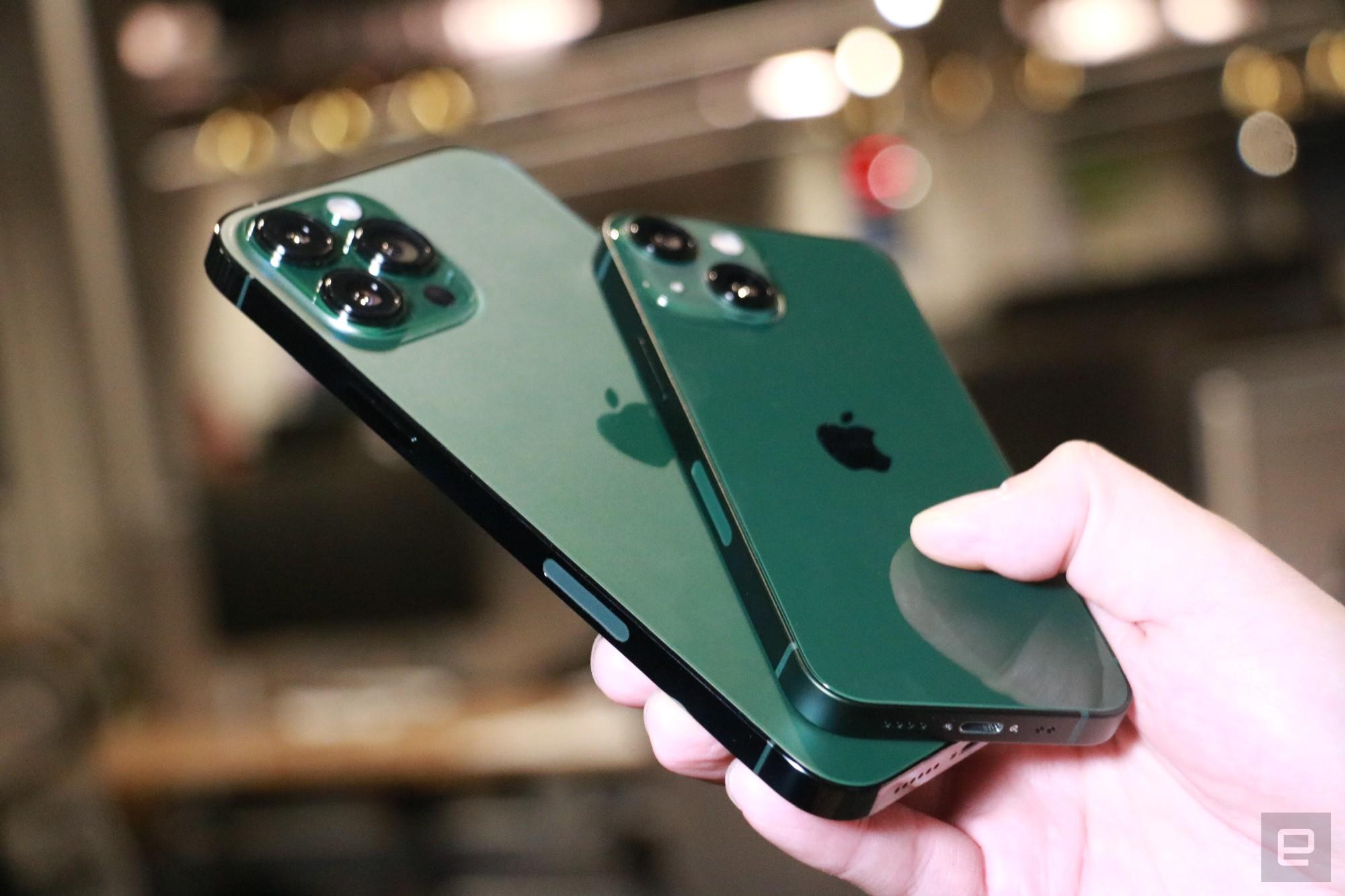 Image via Engadget
The new green color options for the iPhone 13 and the iPhone 13 Pro follow the introduction of the Purple iPhone 12 last year. Green for the iPhone 13 and iPhone 13 mini is a dark, forest-like green, while the Alpine Green for the iPhone 13 Pro and iPhone 13 Pro Max is lighter. ZDNet‘s Jason Cipriani commented:
The iPhone 13’s green color is glossy, like the rest of the color options, and looks more like a camouflage green to my eyes. It’s as dark as the photos on Apple’s website look, but perhaps slightly more vibrant.
[…]
As with the rest of the color options for the iPhone 13 Pro and 13 Pro Max, Alpine Green has a matte finish to it. It’s a lighter version of camouflage green. I can’t decide which color I like more, Sierra Blue or Alpine Green.
The Verge‘s Allison Johnson said that the new green shades are both better than the green color offered with the Samsung Galaxy S22:
The regular green on the standard iPhone is a little more saturated, more Kelly green than I was expecting. It also makes the Apple logo stand out more than I like
[…]
Content was cut in order to protect the source.Please visit the source for the rest of the article.Read the original article: iPhone 13 in Green and iPhone 13 Pro in Alpine Green Reviews: A ‘Saturated’ but ‘Subtle Statement’