This article has been indexed from The Duo Blog

In early 2019, we embarked on a project to improve the Duo Mobile user authentication experience. It was a daunting task, considering we haven’t changed the Duo Mobile application in over seven years.
We had a few simple principles:
- Make it easier for users to enroll and authenticate
- Help users self-remediate, rather than call the help desk
- Make Duo Mobile accessible for all users
I’m excited to announce we’re ready to allow all users to start testing the redesigned application with us in a public preview. Before we do that, I wanted to take some time to share with you exactly how we’re making it easier for users to authenticate using Duo Mobile. As part of the redesign we are:
Educating First-Time Users
For users new to Duo or the idea of 2FA in general, understanding exactly why your employer is asking you to put Duo on your phone is often a burden. Users are concerned about an invasion of their personal space and what a corporate app might do to impact performance on their device.
In order to help users better understand what Duo is really doing, we’ve introduced the concept of inline education in our enrollment flow. We’ve made it simpler to understand how Duo works, what purpose Duo serves and a variety of changes that help ensure end users successfully complete enrollment.
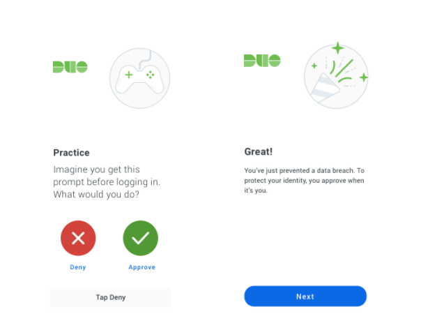
We found this to be incredibly successful in testing these flows with real users. One existing Duo user went as far as to tell us:
“Prior to seeing this, I thought Duo was just an app my employer put on my phone to spy on me. Now I understand it’s actually there to protect my identity.”
Fighting Fraud by Humanizing the Push Screen
Authentication is hard! Users are asked to constantly be on the alert — scrutinizing URLs and email attachments, ensuring they don’t do the wrong thing.
During our research, we found that we can improve the readability of contextual information that was displayed at the time of authentication, and help end users make the right decision.
These findings have been incorporated into the new Duo Push screen. We are shifting
[…]
Content was cut in order to protect the source.Please visit the source for the rest of the article.
Read the original article: Redesigning UI – The Duo Mobile App, What’s New